V Sunil has an unprecedented track record of building iconic companies and brands. In previous avatars over the past two decades, Motherland’s core team pioneered a radically different approach to branding – blurring the borders between agent and entrepreneur, communication and customer experience. This section focuses on examples of this approach, some of which were developed between 2005-2015.

IndiGo

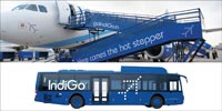
Insight ≥ Back in 2005, low-cost carriers had begun to spread across the world, shaking up the airline industry and democratising air travel. The only drawback was that most of these LCCs worked on a commodity model, wrongly believing low fares and customer experience to be incompatible. Few were aware of the ‘no-frills chic’, a movement that uses creative energy and small, customised touches to enhance overall experience without adding costs. Motherland’s founding team strongly believed that IndiGo could be the foremost example of this philosophy.

Collaborating closely with Rahul Bhatia (founder, IndiGo) and his startup team, Motherland’s founders worked on a comprehensive list of passenger and employee touchpoints to create a slick, functional and engaging interface for frequent and first-time fliers. The design process ranged from cabin specification visits to the Airbus factory to sandwich formulation and testing at the Delhi airport kitchen. Layered over a corporate organisation that is renowned for operational and fiscal excellence, this customer experience blueprint rapidly helped establish IndiGo as the largest, most profitable and most user-friendly airline in India – and soon, the world.

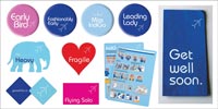
MUCH LOVED INDIGO FOOD PACKAGING WE DESIGNED INDIGO FOOD PACKAGING TO BE MORE ECONOMICAL, ECO-FRIENDLY AND MOST IMPORTANTLY, COLLECTABLE, SO THAT PASSENGERS COULD TAKE THE BRAND HOME. OVER A DECADE LATER, INDIGO TINS ARE STILL HUGELY POPULAR TAKEAWAYS AND HAVE PROVED TO BE A VERSATILE LIFESTYLE ACCESSORY FOR ALL KINDS OF THINGS.
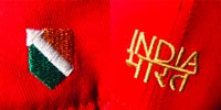
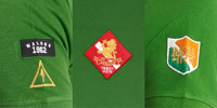
WHILE INDIGO’S CABIN CREW UNIFORMS WERE DESIGNED FOR STYLE AND FUNCTIONALITY, FLIGHT CREW AND ‘GROUND FORCE’ UNIFORMS AND LIVERY HAD A DISTINCTLY AIR FORCE FLAVOUR – A NOD TO INDIGO’S MANY EX-IAF PILOTS, AND ALSO TO THE MILITARY LIKE EFFICIENCY OF THE GROUND TEAMS.

Incredible India

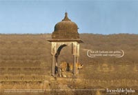
Incredible India was the first marketing initiative of its kind. We conceptualised this path-breaking campaign in 2002 with Amitabh Kant, Joint Secretary, Ministry of Tourism. The primary objective of this exercise was to create a fresh, distinctive identity for the country, something that could capture the imagination of high-end tourists. This resulted in the iconic ‘Incredible !ndia’ logo. The exclamation mark was used to great effect as a slick and extremely memorable branding device across all communications. The campaign successfully established India as an upscale tourist destination, generating a 16% increase in tourist traffic in the first year.

LAUNCH CAMPAIGN 2002/03 THE CREATION OF THE ICONIC '!' LOGO, THAT SYMBOLISED THE INDIA EXPERIENCE FOR MANY YEARS TO COME.
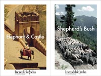
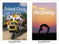
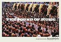
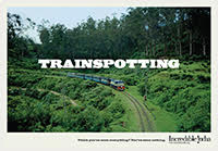
THE 2006/07 CAMPAIGN FEATURED SPECTACULAR IMAGERY ACCOMPANIED BY A WRY, SELF-ASSURED TONE – A SIGNIFICANT DEPARTURE FROM PREVIOUS INDIA CAMPAIGNS, AND A REFLECTION OF A NEWLY RESURGENT SENSE OF NATIONAL IDENTITY.
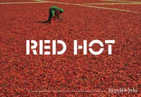
THE COLOURS OF INDIA CAMPAIGN IN 2006/07 SHOWCASED INDIA'S DIVERSE CULTURAL SPECTRUM USING VIVID IMAGERY AND A COLOUR-THEMED NARRATIVE.
ITB Berlin

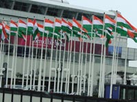
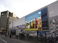
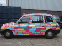
In March 2007, the global India brand campaign was extended to the Internationale Tourismus Bourse (ITB) Berlin – the world's largest travel and tourism show – where India was participating as the Partner Country. The campaign used the entire city as a canvas, covering it with large billboards, branding on taxis and buses, vibrant graphic art and 3D installations. Signalling a new level of sophistication in India's branding strategy, the ITB campaign was a huge hit with international media and trade. By this time, we had become adept at planning city-wide aesthetic and cultural experiences that immersed people in the brand far more effectively than conventional marketing campaigns.

A CITY TAKEOVER DURING ITB BERLIN SAW INDIA BRANDING PRECISELY PLACED IN KEY LOCATIONS.
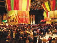
EXPERIENCE INDIA: MULTIPLE EVENTS WERE CURATED TO SHOWCASE CULTURAL VARIETY AND DEPTH. SEEN ABOVE, A SHOT FROM THE CULTURAL EVENING WHERE 45 OF INDIA’S BEST CHEFS WERE FLOWN IN TO CREATE AN ELABORATE 29-COURSE MEAL THAT FEATURED THE COUNTRY’S FINEST CUISINE.
India 60

The year 2007 not only marked the 60th year of independence for India but also celebrated the arrival of India on the global platform. The Incredible India@60 campaign was launched in New York from 23rd-26th September, 2007 to coincide with the UN General Assembly session. The combination of the 4-day event and the General Assembly created the perfect opportunity to showcase the best of India to world leaders, top international business moguls and the public. Incredible India@60 took India’s extraordinary energy and cultural diversity to the watching world. Billboards at Times Square, taxis, buses, bus shelters, TV and radio, announced the arrival of a brand new India. With 8 ministries, 8 overseas partners and 41 events – including 4 gala dinners, 13 conferences and panel discussions, 9 cultural shows, 7 receptions and 8 ongoing events – it was a grand show that maximised India’s presence and visibility to the world.

India Now, London 2007
A 3 MONTH-LONG CAMPAIGN THAT SHOWCASED INDIA'S CULTURE THROUGH EVENTS AND A MAJOR BRAND CAMPAIGN. THE CAMPAIGN PLAYED ON NAMES OF FAMOUS LONDON UNDERGROUND STATIONS, CREATING AN ENGAGING AND AMUSING CONTRAST.
L.A. 2009
HOLLYWOOD MOVIE TITLES WERE SET AGAINST INDIAN IMAGES, APT FOR THE TOWN OF LOS ANGELES.

Royal Enfield

Insight ≥ In 2004, Siddhartha Lal asked us to help restore this legendary automotive brand to its rightful place as a global icon. The challenge was to re-engineer the product and reposition the brand in order to make it more accessible – but without diluting its precious DNA. The new brand vibe positioned Royal Enfield as an alternative way of life – a unique mental and physical ‘trip’, a road to inner peace. This new positioning also channeled the company’s Anglo-Indian roots for cool, neo-hippy cues: in our minds, the brand existed on a metaphysical highway somewhere between London, Goa, Chennai and Ladakh.

We translated this reinvented brand vibe across all touchpoints including store design, tank badges and model names, community messaging and merchandise. The new positioning helped boost sales by 6x in 5 years and put Royal Enfield firmly back on the road to recovery. We subsequently worked with Siddhartha Lal on the global launches of the Café Racer and the Himalayan, by which time the world had acknowledged that Royal Enfield was back in top form and more relevant than ever.

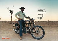
'TRIP' CAMPAIGN 2006

FEATURED REAL ROYAL ENFIELD RIDERS WITH THEIR ACTUAL BIKES AND THEIR ACTUAL STORIES. THIS WAS OUR TRIBUTE TO THE AUTHENTIC CHARACTER OF THIS LEGENDARY MOTORCYCLE AND ITS EQUALLY LEGENDARY OWNERS.

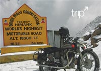
'TRIP' CAMPAIGN 2006

FEATURED REAL ROYAL ENFIELD RIDERS WITH THEIR ACTUAL BIKES AND THEIR ACTUAL STORIES. THIS WAS OUR TRIBUTE TO THE AUTHENTIC CHARACTER OF THIS LEGENDARY MOTORCYCLE AND ITS EQUALLY LEGENDARY OWNERS.

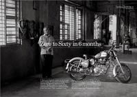
HANDCRAFTED IN CHENNAI 2009

IN AN AGE OF AUTOMATION, WHERE MOTORCYCLE COMPANIES ROLLED OUT HUNDREDS OF PIECES EVERYDAY, ROYAL ENFIELD REPRESENTED SOMETHING MORE REAL. THIS CAMPAIGN WAS OUR TRIBUTE TO THE PLACE, THE PEOPLE AND THE PROCESS THAT MADE ROYAL ENFIELD MOTORCYCLES UNIQUE.

CONTINENTAL GT LAUNCH 2013

THE CONTINENTAL GT OCCUPIED A PLACE OF HONOUR IN BRITISH AUTOMOTIVE AND POPULAR CULTURE – IT WAS THEREFORE VITAL TO PROVIDE POTENTIAL OWNERS WITH THAT CONTEXT, ESPECIALLY IF THEY WERE FROM GENERATIONS OR GEOGRAPHIES THAT DIDN’T HAVE A SHARED HISTORY. WORKING WITH SPECIALISTS IN INDIA AND THE UK, WE RECREATED THIS CONTEXT WITH A THOROUGHLY RESEARCHED AND BEAUTIFULLY PRODUCED SET OF INTERVIEWS, MAGAZINES, MERCHANDISE AND FILMS.

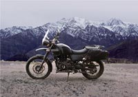
HIMALAYAN LAUNCH 2016

WE WORKED WITH SIDDHARTHA LAL TO NAME AND LAUNCH THE HIMALAYAN – AN ODE TO THE BRAND’S SPIRITUAL HOME, AND THE FIRST EVER MOTORCYCLE DEVELOPED FROM SCRATCH BY THE COMPANY.

Make in India

Insight ≥ In 2013, India’s growth rate had fallen to its lowest level in a decade. In 2014, th e Government responded with an ambitious plan: a major national program designed to facilitate foreign investment and transform India into a major global manufacturing hub. This required an equally ambitious brand strategy. Instead of an ad campaign, we decided to create a multi-layered program that could (a) inspire confidence in India’s manufacturing capabilities; (b) make vital technical information available; and (c) update audiences frequently about opportunities and reforms.

A small multi-disciplinary team consisting of strategists, experience designers, journalists, economists and social media experts were selected for this formidable task.

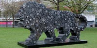
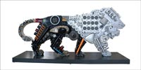
First, we worked on the inspirational elements. The clichéd phrase ‘Made in India’ was deftly transformed into a powerful call to action reflective of modern India – ‘Make in India’. For the iconography, we turned to India’s national emblem for inspiration. The prowling lion stands for strength, courage, tenacity and wisdom – values that are every bit as Indian today as they have ever been. Next, we created a platform that would help spread the message globally: a world-class brand experience was developed and the program was officially launched by the Prime Minister in an event that was orchestrated to perfection. The result: Make in India trended worldwide for one hour on the day of the launch.

THE MOST PHOTOGRAPHED INSTALLATION AT HANNOVER MESSE 2015. THIS MAKE IN INDIA LION WAS GIFTED TO THE CITY OF HANNOVER BY INDIA’S PRIME MINISTER NARENDRA MODI.
Make in India/Hannover

In April 2015, India took centre stage as partner country at Hannover Messe, Germany, the world’s largest industrial fair. Our mission was to make India’s presence felt. We took over the city of Hannover and made sure the lion was impossible to miss. Starting with buses, trains, trams, billboards and digital screens across airports in Berlin, Frankfurt and Munich, and moving to ubiquitous branding across all parts of Hannover. We also designed a state-of-the-art India pavilion in partnership with the best architect- ural companies from India and Germany. Rooted in India’s profound traditions, the pavilion was a showcase of India’s manufacturing capabilities across core sectors of the Indian economy through larger than life graphics, art installations and events. The huge success of this participation led to a positive image change and a stronger partnership between India and Germany.

PRIME MINISTER MODI WITH GERMAN CHANCELLOR ANGELA MERKEL AT THE MAKE IN INDIA PAVILION, HANNOVER MESSE 2015.
PLANNED AND EXECUTED BY US DOWN TO THE SMALLEST DETAIL, INDIA AT THE HANNOVER MESSE 2015 WAS LAUDED AS ONE OF THE BEST ’PARTNER COUNTRY’ PARTICIPATIONS IN THE MESSE’S HISTORY.
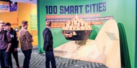
THE SMART CITY IMMERSIVE MODEL, A GLASS AND LIGHT INSTALLATION WAS BASED ON THE BLUEPRINT OF THE DHOLERA SPECIAL INVESTMENT REGION (SIR), GUJARAT. THIS INSTALLATION PROVIDED A 24-HOUR CYCLE OF A SMART CITY, DEPICTING AN INTEGRATED APPROACH TO IMPROVE ECONOMY, GOVERNANCE AND EFFICIENCY.
A REVOLVING MODEL CRAFTED IN WOOD PROUDLY SHOWCASED INDIA’S BIGGEST PLANNED URBANISATION INITIATIVE IN RECENT TIMES – 100 SMART CITIES, PLANNED ALONGSIDE NEW INDUSTRIAL CORRIDORS AND A DEDICATED FREIGHT CORRIDOR.
HANNOVER CITY TAKE-OVER AND GERMAN AIRPORT BRANDING COVERED ALL ENTRY AND EXIT POINTS WITH SITE SPECIFIC MAKE IN INDIA MESSAGING. INSTALLATIONS OF SECTOR-SPECIFIC LIONS WERE ALSO PLACED ACROSS THE MESSE GROUNDS.
Make in India Week, Mumbai

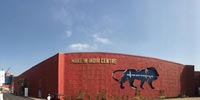
Much like the earlier Incredible India city takeovers, this was another example of our signature approach to national brand-building. The Make in India Week, a 5-day event hosted in Mumbai, showcased the potential of design, innovation and sustainability across India’s key focus sectors through a series of outreach initiatives. From industry leaders, policymakers and entrepreneurs to government officials, academics and the press, the world’s finest minds converged during the Make in India Week and deliberated on key policies, practices and reforms that can facilitate a progressive industrial environment. The event was focused around a 2.5 million sq. ft. exhibition – the Make in India Centre, that showcased innovative products and manufacturing processes developed across India. Built from the ground up at MMRDA Grounds, the official headquarters of Make in India Week was an avantgarde statement in design – merging traditional craft aesthetics with a futuristic vision. The iconic Make in India lions adorned the hall walls, representing each of India's key focus sectors; the nation's proudest economic achievements were displayed all around the Make in India Centre. The result: an impressive structure that distilled India’s past, highlighted its present capabilities and projected its promising future.

A vibrant new energy spread across Mumbai during the Make in India Week. Iconic lion installations, street art and 150 events spread across Mumbai’s museums, galleries and theaters added an element of cultural buzz while lighting up the city.

THE INSPIRATION BEHIND THE 2.5 MILLION SQ. FT. MAKE IN INDIA CENTRE FAÇADE WAS JODHPUR’S FAMOUS RED SANDSTONE FILIGREE WORK, WHICH SEAMLESSLY BLENDED TRADITIONAL CRAFT WITH CONTEMPORARY DESIGN. SHOWN IN PICTURE – TWO GIGANTIC LED LION DISPLAYS AT THE MAIN ENTRANCE THAT ENGAGED THE PUBLIC BY RUNNING REAL TIME INFORMATION.
AUTOMOBILE LION INSTALLATION: CHHATRAPATI SHIVAJI TERMINUS, MUMBAI
A 20FT. INSTALLATION AT HAJI ALI, MUMBAI
LARGE SECTOR SPECIFIC INFOGRAPHICS ADORNED THE EXHIBITION HALLS – IT WAS ALL ABOUT MERGING ART AND DATA, INSPIRATION AND INFORMATION.
WE SAW MUMBAI’S STREETS AND SUBWAYS AS THE PERFECT CANVAS FOR US TO DISPLAY COMPELLING FACTS ABOUT INDIA’S MAJOR ECONOMIC FEATS.
THE FLAGSHIP MAKE IN INDIA WEEK WAS THE LARGEST MANUFACTURING EVENT INDIA HAD EVER SEEN. THE WEEK GARNERED LARGE-SCALE INVESTMENT COMMITMENTS FROM AROUND THE WORLD, GALVANISING THE CALL TO MAKE INDIA, THE WORLD’S MOST PREFERRED MANUFACTURING DESTINATION.
Social Media
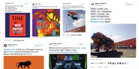
MAKE IN INDIA’S SOCIAL WAS USED AS A MOUTHPIECE FOR THE INITIATIVE – FROM BREAKING DOWN HARD-TO-DIGEST FACTS TO DISSEMINATING INFORMATION. LIVE COVERAGE FROM EVENTS FEATURING MINISTRIES, INDUSTRY EXPERTS AND THOUGHT LEADERS GAVE INSIGHT INTO THE WAYS AND WORKINGS OF THE INITIATIVE. THE RESULT: A HUGELY SUCCESSFUL OUTREACH CHANNEL.
Pop Culture
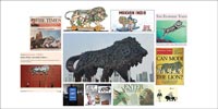
AS SOON AS IT WAS LAUNCHED, MAKE IN INDIA WAS EMBRACED BY THE FORCES OF GLOBAL POPULAR CULTURE – THE LION STARTED POPPING UP ON APPAREL, PACKAGING, CARTOON STRIPS, MAGAZINE COVERS, SME ADVERTISEMENTS AND ALL KINDS OF MERCHANDISE. THE DEFINING POP CULTURE MOMENT WAS THE SHOWSTOPPING APPEARANCE OF A GIANT STEEL LION AT THE REPUBLIC DAY 2015 PARADE. FITTINGLY, IT WAS IN THE PRESENCE OF YET ANOTHER ICON OF CONTEMPORARY CULTURE – PRESIDENT BARACK OBAMA.

OYO Townhouse 2017

Insight ≥ Create a hip, hyper-local alternative to the soulless one-size-fits-all template offered by traditional hotel chains.

Working closely with OYO’s rapid transformation team, Motherland discarded the wasteful conventions of the hospitality industry and developed a product design and customer experience from scratch. Every single element – right from furniture ergonomics to the breakfast menu – was re-engineered to deliver higher quality and better value. Even locations were carefully selected so that they complemented the neighbourhood, in addition to which we developed a host of amenities and offers geared to the needs of local residents. OYO Townhouse was an instant hit in India, and Motherland worked with OYO's global teams to ensure quick and high-quality expansion of the Townhouse brand into international markets such as the UK. This category reinvention has resulted in a new kind of hotel that is optimised for comfort, efficiency, convenience and affordability – which is why we call it ‘your friendly neighbourhood hotel’.

WE WANTED CUSTOMERS AND EMPLOYEES TO KNOW WHAT IT TOOK TO CREATE A HIGH QUALITY EXPERIENCE AT AN AFFORDABLE PRICE POINT: THIS DETAILED INFOGRAPHIC REVEALED THE ‘SIX LAYERS OF INNOVATION’ WITHIN EVERY TOWNHOUSE.
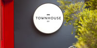
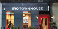
FOLLOWING AN INTENSE 8-WEEK PRODUCTION SPRINT BY MOTHERLAND AND OYO’S TRANSFORMATION TEAMS, THE FIRST OYO TOWNHOUSE OPENED IN GURGAON IN JANUARY 2017.
THE FIRST OYO TOWNHOUSE IN THE UK: 30, SUSSEX GARDENS MOTHERLAND’S LEADERSHIP TEAM WAS ON THE GROUND TO ENSURE THAT THE TRANSFORMATION WAS COMPATIBLE WITH LOCAL URBAN CONTEXT AND REGULATORY POLICIES.
OYO TOWNHOUSE 001, GURGAON OYO’S FOUNDER & LEADERSHIP TEAMS HELD REGULAR MEETINGS WITH MOTHERLAND AT THIS SITE IN ORDER TO FINE-TUNE THE EXPERIENCE AND FINALISE THE BLUEPRINT FOR THE SCALE-UP PHASE. WITHIN A YEAR OF THIS PROTOTYPE LAUNCH, OYO TOWNHOUSES HAD BEEN SET UP IN ALL MAJOR METROS.
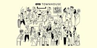
A SERIES OF ILLUSTRATIONS CREATED BY NOUSVOUS.EU, COMMISSIONED BY MOTHERLAND, PART OF THE OYO TOWNHOUSE EXPERIENCE DESIGN. THESE WERE USED ACROSS ALL PHYSICAL AND DIGITAL TOUCHPOINTS, SOME AS LARGE WALL GRAPHICS ACROSS THE HOTELS.

OYO City 2018

Insight ≥ As OYO’s product and brand portfolio expanded into an ever-increasing set of geographies and categories, a clear and consistent overview was urgently required so that existing and potential partners, employees and vendors could get the big picture. A visual expression of brand architecture was the answer, as opposed to a giant organisation chart.

Motherland commissioned renowned artist Rod Hunt to bring OYO’s product and service portfolio to life in vibrant pop art, while also highlighting the significant milestones in their amazing growth journey. His signature illustrations for OYO were extended to the OYO user manual and wall murals across OYO properties, beautifully differentiating the brand in the eyes of customers (and competitors!).

THE FAMOUS OYO SUPERGRAPHIC – KNOWN INTERNALLY AS THE 'GOLU' – WAS INSPIRED BY KOREAN APARTMENT BLOCK SIGNAGE, AND CREATED BY DESIGN COMPANY FIELD PROJECTS IN RESPONSE TO A MOTHERLAND BRIEF. GUESTS WERE STRUGGLING TO LOCATE MEDIUM-SIZED PROPERTIES, SO WE DECIDED TO SOLVE THE NAVIGATIONAL PROBLEM BY USING OUR REAL ESTATE TO CREATE THESE GIANT WAYPOINTS (IT WAS ALSO A GREAT WAY TO LET PEOPLE KNOW THAT EVERY CITY WAS AN OYO CITY!).
OYO'S DISTINCTIVE 'UNIQUE ID' NUMBERING SYSTEM DEVELOPED BY MOTHERLAND IN RESPONSE TO A BRIEF FROM THE FOUNDER AT AT A TIME WHEN OYO WAS ADDING SUCH LARGE QUANTITIES OF INVENTORY THAT IDENTIFICATION OF INDIVIDUAL PROPERTIES WAS BECOMING A CHALLENGE.
THE INIMITABLE ROD HUNT WAS COMMISSIONED BY MOTHERLAND TO GIVE EVERYBODY A ROD’S - EYE VIEW OF THE EXPONENTIALLY GROWING OYO NETWORK. MAP OF NORTH GOA INDICATING OYO PROPERTIES, POINTS OF INTEREST AND GENERAL ATTRACTIONS
THE INIMITABLE ROD HUNT WAS COMMISSIONED BY MOTHERLAND TO GIVE EVERYBODY A ROD’S - EYE VIEW OF THE EXPONENTIALLY GROWING OYO NETWORK. OYO CITY SCAPE
THE INIMITABLE ROD HUNT WAS COMMISSIONED BY MOTHERLAND TO GIVE EVERYBODY A ROD’S - EYE VIEW OF THE EXPONENTIALLY GROWING OYO NETWORK. OYO SUB-BRANDS, CONCEPTUALISED BY MOTHERLAND

Motherland x Gary x Nicobar 2018

Insight ≥ Conventional product development and marketing models lack cultural relevance because they are driven by process, not design. Motherland fixes this by connecting dynamic enterprises, progressive institutions and celebrated individuals to create products, collections and experiences that generate higher value for all concerned – especially consumers.

This focus on blending culture and customer experiences led Motherland to conceptualise the Gary Mehigan x Nicobar collaboration, a range of high quality products infused with design and craft. In addition to conceptual and branding guidance, Motherland was instrumental in showcasing this initiative at the Australian government’s OZ Fest in India program – a textbook example of cultural and commercial integration.

INDIAN OCEAN COLLECTION LAUNCH AT THE AUSTRALIAN HIGH COMMISSION, NEW DELHI HOSTED BY THE AUSTRALIAN HIGH COMMISSIONER, H. E. MS. HARINDER SIDHU AS PART OF THE AUSTRALIA FEST 2018.

JDH Urban Regeneration Project 2016

Co-founded by Motherland and the RAAS Group, JDH is an Urban Regeneration Project that is restoring the Walled City of Jodhpur to its former glory, breathing new life into its invaluable landmarks and livelihoods. The creative forces of design, technology, fashion and culture have begun to converge on Jodhpur’s ancient and hallowed ground, revitalising its atmospheric gullies, havelis and bazaars. This transformation is being driven by local insights and expertise, as well as the injection of new ideas, infrastructure and influences from all over the world. The result: a living, breathing work of art in progress.

JDH is a part of Blue City Hospitality Pvt. Ltd. It is not a conventional business model, rather, it is a social enterprise that aims to preserve Jodhpur’s historical traditions and legacies. JDH is a privately funded company with investments from H.H. Maharaja Gaj Singh II of Jodhpur, Jonathan Boyer & Nicholas Allan (investors in the RAAS group of hotels), Anita Lal of Good Earth, and Alexander Wade.

Project Inception: The Stepwell (Toorji Ka Jhalra) Restoration

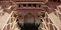
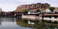
Established in January 2015, JDH used private investment and ideas to clean up public spaces which were no longer viable due to congestion, litter and neglect. A Public-Private model was used to integrate a set of investors, the state government and a highly supportive local community. By July 2017, a small section of the Walled City was completely transformed. At its epicentre was ‘Toorji Ka Jhalra’ – a public stepwell that was restored to its original state. Over 300 tractor-trolley loads of debris were removed, and extensive sandblasting and oxygenation was carried out under the guidance of a team of restoration experts. The public responded by thronging to the area and making it the second most popular spot for locals and tourists in Jodhpur, as ranked by Trip Advisor.

This small step was the starting point of a much more important movement. JDH began to create ‘zones of renewal’ throughout the city and map them on an axis of regeneration. These zones are a mix of project-supported, locally-owned, project-owned, project-leased and government-owned. The project continues to expand, but the fundamental mission remains the same – renewing the Walled City, while protecting the rich history and heritage of Jodhpur.

TOORJI KA JHALRA BEFORE RESTORATION
TOOR JI KA JHALRA’S RESTORATION REVEALED LAYERS OF BURIED HERITAGE
Stepwell Square – Retail, F&B and Public Spaces

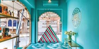
The Stepwell Square in the Walled City is the first of JDH’s zones of renewal. With the restoration of the Stepwell at the epicenter, JDH added a new commercial layer to this part of the Walled City. By placing some of India's finest fashion and lifestyle brands and creating a hub of eateries, the Stepwell Square has quickly evolved into a profitable business ecosystem and a melting pot of culture for tourists and locals alike.

GOOD EARTH SHOWROOM: OPENED IN NOV 2017
ZBEES : ZERO-EMISSION ELECTRIC VEHCILES HAVE BEEN DEPLOYED AT THE STEPWELL SQUARE AND RAAS.
FOREST ESSENTIALS CONCEPT STORE: OPENED IN AUG 2017
The Maharaja Sumer Grain Market (WIP)

A few minutes away from the Stepwell Square is a 19th century ‘Bourse’ that is still operative. This vital part of Jodhpur’s heritage is set to be converted into a fully functioning farmer’s market that will support local producers, complemented by an Art Deco restaurant, cafés and local street food vendors that will bring in visitors and additional revenue streams.

Gulab Sagar Ki Haveli

Part of JDH’s expansion plan, this site borders the Gulab Sagar lake, which is presently undergoing restoration. A yoga studio started operations in late 2018, and more activities will follow in 2020.
Highlights 2019

RED BULL CLIFF DIVING AT THE STEPWELL SQUARE NOV 2019

TO COMMEMORATE JODHPUR’S STATUS AS THE CRADLE OF INDIAN AVIATION, JDH & RAAS HOSTED THE IWC SILVER SPITFIRE IN NOV 2019 (PHOTO: BEN UTTLEY).

Article Image
Article Image
Article Image
Article Image
Article Image
Article Image
Article Image
Article Image
Article Image
Article Image
Article Image
Article Image
Article Image
Article Image
Article Image
Article Image
Article Image
Article Image
Article Image
Article Image
Article Image